
A responsive WordPress theme doesn’t automatically make your website mobile-friendly. Responsiveness isn’t a perfect synonym for mobile-friendliness. Yet, a responsive design is mandatory for a mobile-friendly website.
The number of mobile users surpassed the number of desktop users a few years ago. The difference continues to grow and it’s safe to assume that desktop users will never again be more numerous than mobile users.
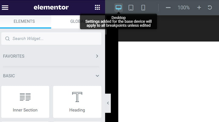
Despite that, many webmasters still focus more on desktop users. Sometimes consciously, sometimes unconsciously. Don’t blame yourself for this mistake; even complex page builders like Elementor discretely suggest that desktop users are more relevant.
Don’t fall into this trap. Instead, adopt a “mobile-first” approach. Start building for the smallest screen size—it’s the winning strategy from a long-term perspective. The following tips will help you make your website more mobile-friendly.
Users Are Everything
You may be tempted to believe that only enterprise projects have the budget to focus on the needs of the audience. Webmasters of small and medium websites run their websites primarily based on previous experiences. It’s not necessarily a bad approach, but it limits how you scale up the business. The truth is that you can do more for your users even though you are on a budget.
Start with Google Analytics that provides a good and reliable set of data to profile your audience. Look at the proportion of mobile users, webpages visited, time on site, and demographics. Interpret the data and craft strategies to better serve customers. Indeed, some aspects are more sophisticated, but some analytics can be interpreted by beginners. For instance, determine where most of your customers come from. Your site will load faster if you host it on a server closest to the largest share of your customers. Just change the servers’ location and your site will load faster for your customers.
Remove Unnecessary Content
Don’t be ashamed if you have focused more on the desktop layout of your site. You are not alone and it can take time to switch focus. If you plan to launch a new website, keep in mind an individual using a small screen device on a poor Internet connection. Your website should load as fast as possible and deliver the desired information frictionlessly. In this context, any additional piece of content impacts the site’s performance. This approach guarantees that you add only essential content to your website.
It’s more challenging if you have already run a website crafted for desktop users. Your site architecture corresponds to considerably more screen estate. Yet, you have to adapt to the needs of mobile users. Luckily, modern WordPress themes allow the customization of each pixel of the site’s pages. It just takes time to identify and remove the non-crucial content.
Test Everything

Plenty of articles related to website mobile-friendliness mention testing in the last paragraphs. Indeed, testing is the final phase, but it’s good to remember that you can perform tests after each change to the website layout. It’s of great help, especially for less-trained webmasters. In this way, you have granular control over each modification. The depth of the tests varies on the magnitude of the changes. A major revamp implies more tests and you may need professional feedback. A subtle change, like a color contrast improvement, doesn’t need complicated tests, just a simple check by using a color contrast checker.
Performance Audit
Is a more performant website a more mobile-friendly one? To some extent, yes, it is! Indeed, website performance is a standalone area, but there is a blurred line between performance and mobile-friendliness. A website can’t be mobile-friendly if it loads slowly. Therefore, audit your site performance to make it genuinely mobile-friendly.
It’s up to you how to audit the site performance, but Google PageSpeed Insights and GTmetrix are two commonly used tools. These provide useful recommendations to improve your website and you should follow them.
Some of the most common recommendations are:
- Image optimization and use of a modern format. You improve the site loading speed and, at the same time, ensure a great user experience by delivering quality images to site visitors.
- Minify CSS and JavaScript code. CSS and JavaScript minification is the process of minimizing the code without affecting its functionality. Most likely, your code is too large due to a complicated site structure and you should remove some elements. So, it comes down to the above suggestion—remove unnecessary content!
- Eliminate the resources blocking the rendering. Once again, simplicity goes hand-in-hand with performance and mobile friendliness.
Size, Space, Placement

You have a general idea about the particularities of mobile users because you’ve likely visited thousands of websites with your handheld devices yourself. You’ve probably noticed the strengths and weaknesses of each website. Here is a short recap of the most common features you should include to make your website mobile-friendly:
- Buttons must be tappable. Think of your fingers when you design tappable items on your website layout. These should be at least 10 mm x 10 mm to be finger-friendly.
- Be aware of the thumb zone. Mobile design is mostly about restrictions. A mobile screen is not only smaller than a desktop screen, but it is also not equally touchable. The thumb zone is the easiest to use, and you should focus on this zone for the crucial elements of your website. Don’t ever add vital tappable items in the hard-to-reach one-handed zone.
- Space out links. You know how annoying it is to tap on an unwanted link. Don’t frustrate your users. Properly space out links and clickable items.
- Readable fonts. No matter how much you like a font, your website is for customers and should serve them as well as possible. Use readable fonts and a size that allows reading the content from a normal distance.
- Color contrast is pivotal. That’s one of the consequences of the desktop’s influence. Unlike desktop users, people use handheld devices in numerous contexts—including in bright environments. Strong color contrast is necessary to help your site visitors in these situations.
Wrapping Up
These pieces of advice will help you make your site more pleasant for mobile users. Bear in mind that a mandatory condition to apply all the above is a fully responsive WordPress theme. Else, it’s a near-impossible mission to build a mobile-friendly website. Nowadays, most themes are responsive, so likely, your site has installed a responsive theme.
A website will never be mobile-friendly enough, but you will take important steps for delighting your site visitors by applying the above rules.
Leave a Reply